
OurHarvest
REBRAND AND UI DESIGN
OurHarvest is a grocery delivery service that delivers fresh, local food straight from the farm to your door. While OurHarvest has some of the best products to offer in the New York area, their brand image didn't originally reflect their position as one of the top providers of farm to table products. That's when they brought me in to help refresh the brand and revamp the customer experience. Check out their new site here.
The Task
Develop a new visual identity to help OurHarvest stand out in the growing grocery and meal delivery space
Improve the user experience on both mobile and desktop to provide a smoother shopping experience
Create flexible and customizable assets for the website and marketing materials showcasing featured products and suppliers to help customers discover new offerings
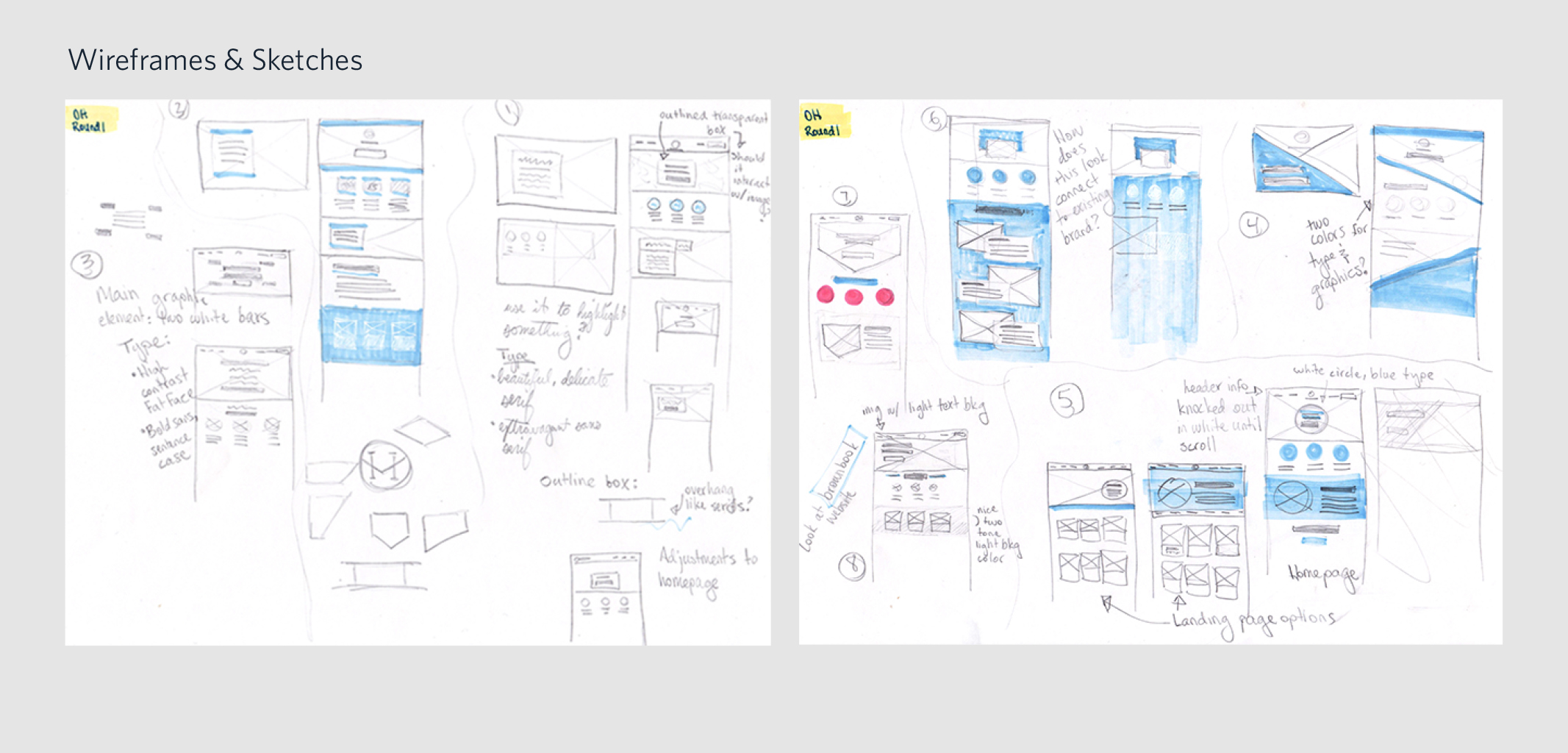
The Process — Phase 1
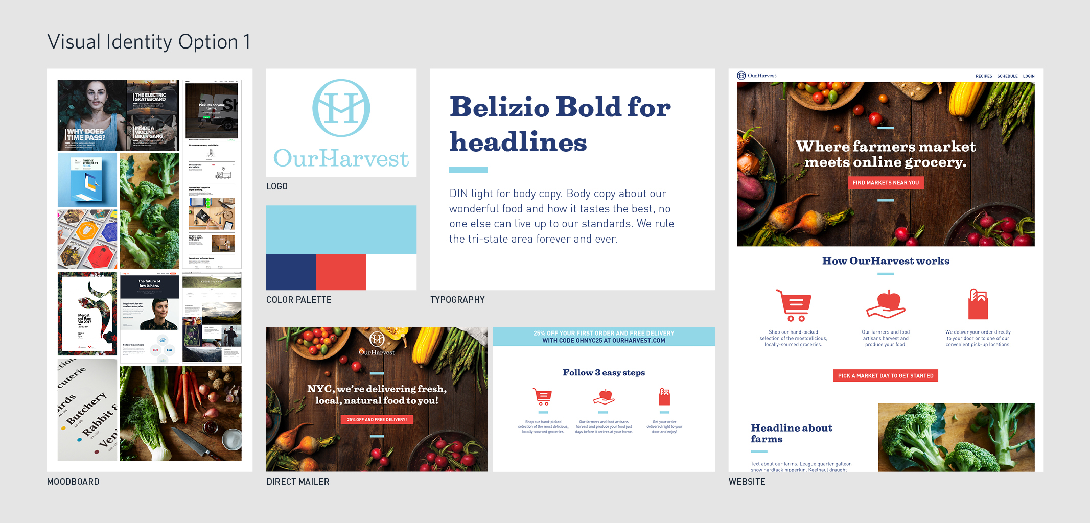
I began this process by focusing on the visual identity. I researched competitors’ branding within the grocery category as well as the wider delivery service category. OurHarvest's only parameters were to preserve their logo and light blue. With these elements in mind, I gathered visual inspiration for moodboards and explored different directions through thumbnails and wireframes. From the thumbnails, I honed in on three distinct identities to develop and discuss with the OurHarvest team.


The Process — Phase 2
While working on the overall branding, I also collaborated with the OurHarvest team to evaluate research and customer feedback about the shopping experience. These discussions led us to the insights outlined below. After we chose to move forward with Visual Identity 1, I began work on these areas for improvement.
HOMEPAGE
It took a long time for a new customer to reach the shopping page. First, they had to select their area. Then, they had to search through different neighborhoods on the schedule page to see if pick up, delivery or both were available. At the same time, customers also had to choose a delivery date—before seeing a single product.
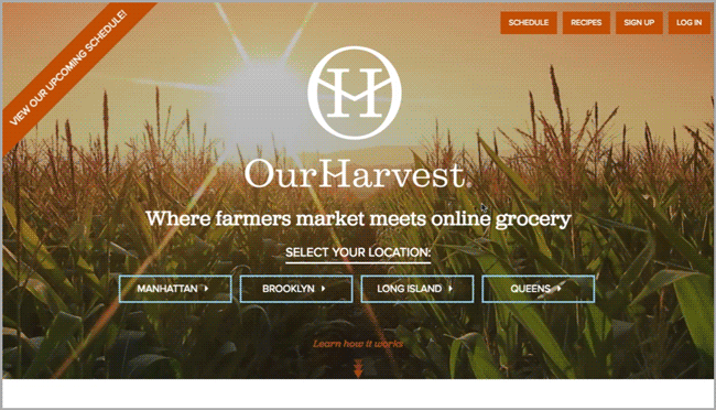
Old OurHarvest Homepage
The OurHarvest team and I discussed the smoothest way to lead a new customer from the homepage to the shopping pages. We mapped out a new user journey that starts with customers entering their zip code on the homepage. Then, a modal will notify them about which delivery or pick up options are available, without making the customer search through other, irrelevant neighborhoods. Delivering this information in a modal allows the user to easily exit out and head straight into shopping.


LANDING PAGE
When a returning customer came to the site, they landed on the "featured" tab on the shopping page. This page gave no sense of beginning the shopping experience; it felt like being dropped into the middle of the process. In addition, this "featured" page looked the same as the department pages and did not clearly communicate why products were featured.

Old Landing Page

New Landing Page
For the new landing page, I emulated the homepage layout with a hero image at the top and a headline. This differentiates the landing page from the regular department shopping pages full of product tiles. The OurHarvest team and I crafted this template that can easily feature new and interesting content about seasonal produce or farmers.


NAVIGATION
The navigation bar could become overwhelming since there was so much information displayed all at once. Various drop down menus appeared for the departments as well as the delivery options.

Old Navigation Bar
I simplified the menu by creating broader parent categories, like “Departments.” By breaking this information down into bitesize chunks, it makes it easier for the user to find what they need, and hide what they do not need.

PRODUCT TILES
Because of the text's size, placement and colors, the information hierarchy did not fit the customers needs well. For example, the total price could be difficult to find since it was a smaller text size, not bold and tucked away in the bottom left corner.

Old Product Tiles
First I took stock of the information presented on the product tiles, and then wrote out the ideal hierarchy for each of these elements. This helped me assess the success of my wireframes as I worked through a design exploratory.


The Finished Product
When it all came together, we applied the new brand identity to the across all devices, as well as print and marketing materials. Assets like the landing page and emails could be customized to feature new farmers, artisans and peak season produce.
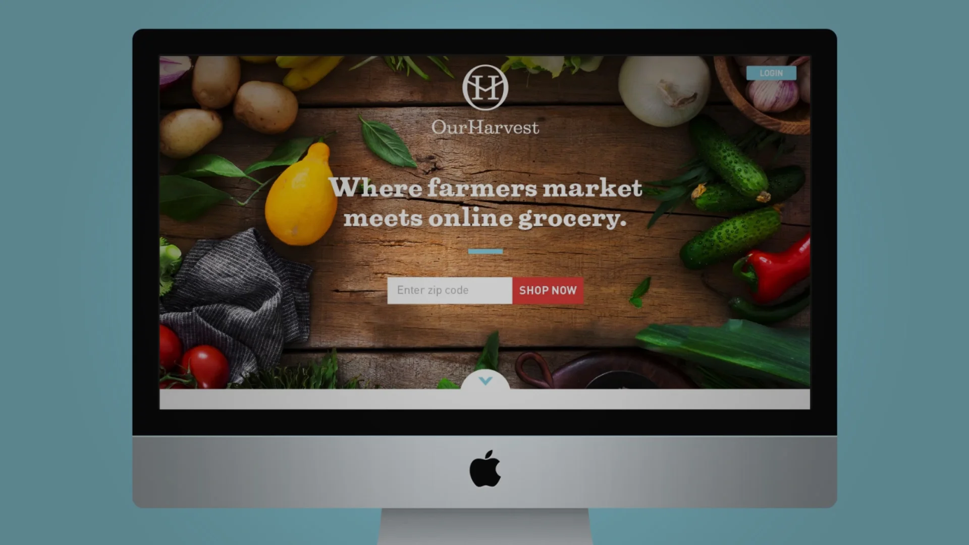
Website experience on desktop

Website experience on mobile

Direct mailers

Email templates